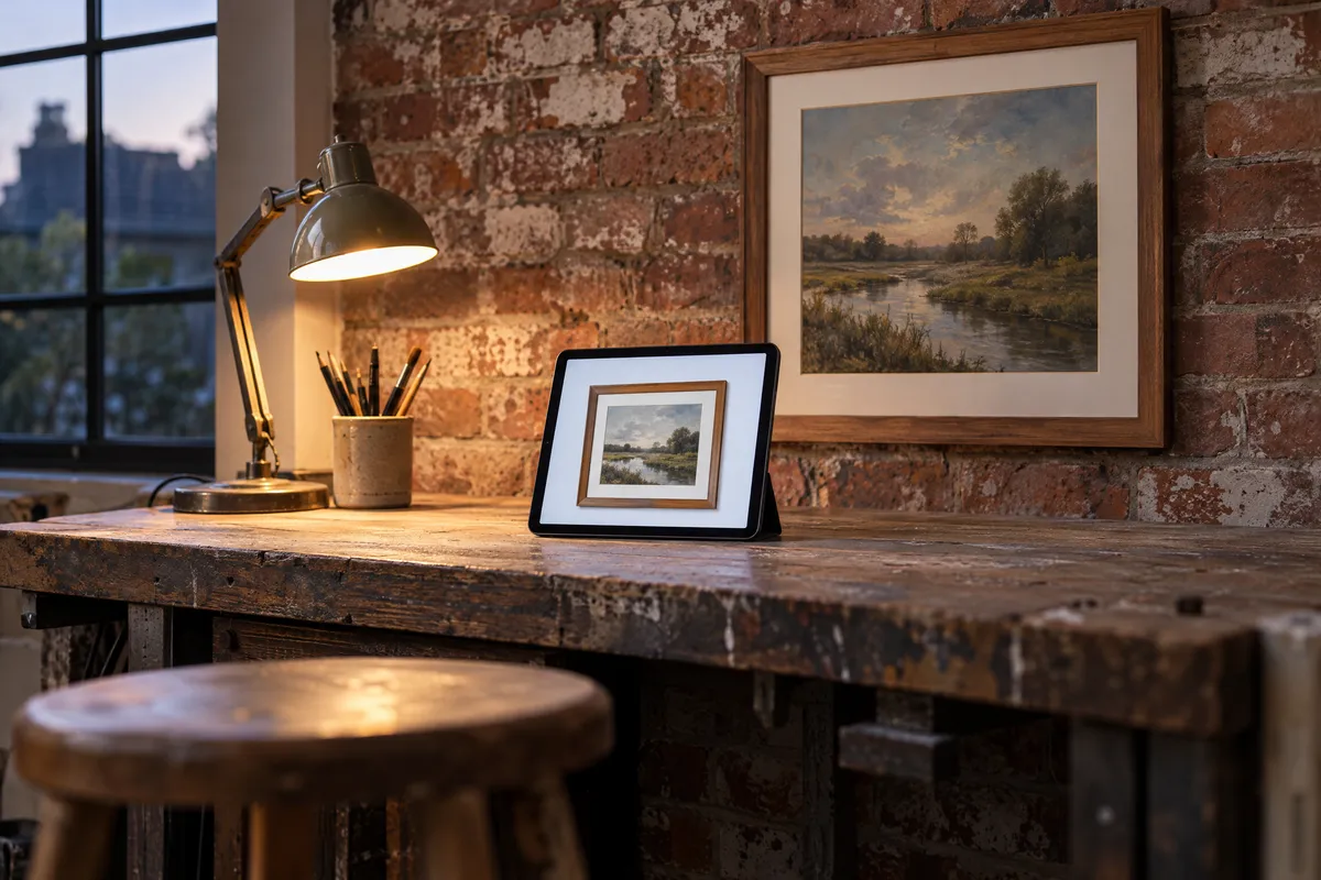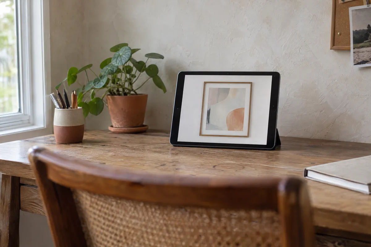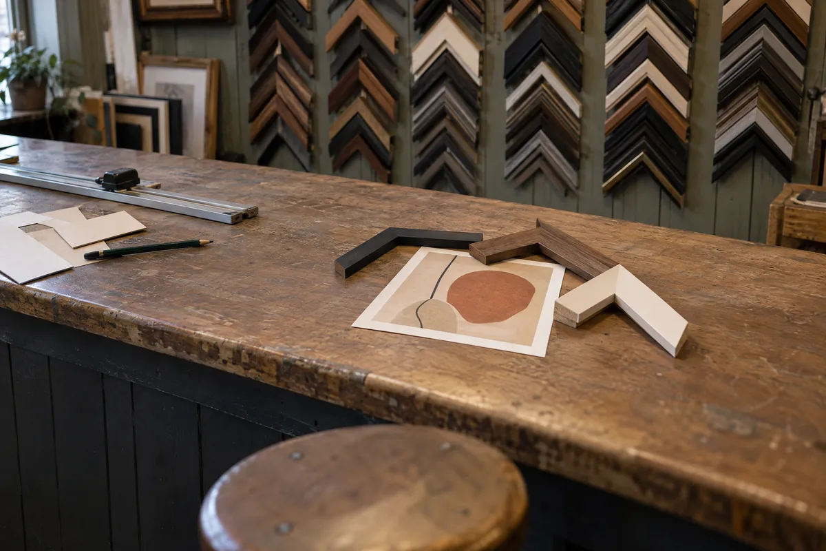
The frame you choose can make or break how your artwork is perceived. A well-selected frame enhances your piece, draws the eye inward, and creates a cohesive presentation. A poorly chosen frame distracts, clashes, or diminishes the artwork's impact. This guide will teach you how to select frames that elevate your art every time.
Understanding Frame Basics
Before diving into selection strategies, let's establish the fundamental components of picture framing.
Frame Components
- Profile/Moulding: The frame itself: its width, depth, and shape
- Mat board: The border between artwork and frame (optional but recommended)
- Glazing: Glass or acrylic protecting the artwork
- Backing: Support material behind the artwork
- Hardware: Hanging mechanisms
Each component influences the final presentation. For this guide, we'll focus primarily on the frame profile and mat board, as these have the most visual impact.
The Art Style Rule
The most fundamental principle in frame selection is matching the frame style to the artwork's style and era.
Traditional Artwork → Classic Frames
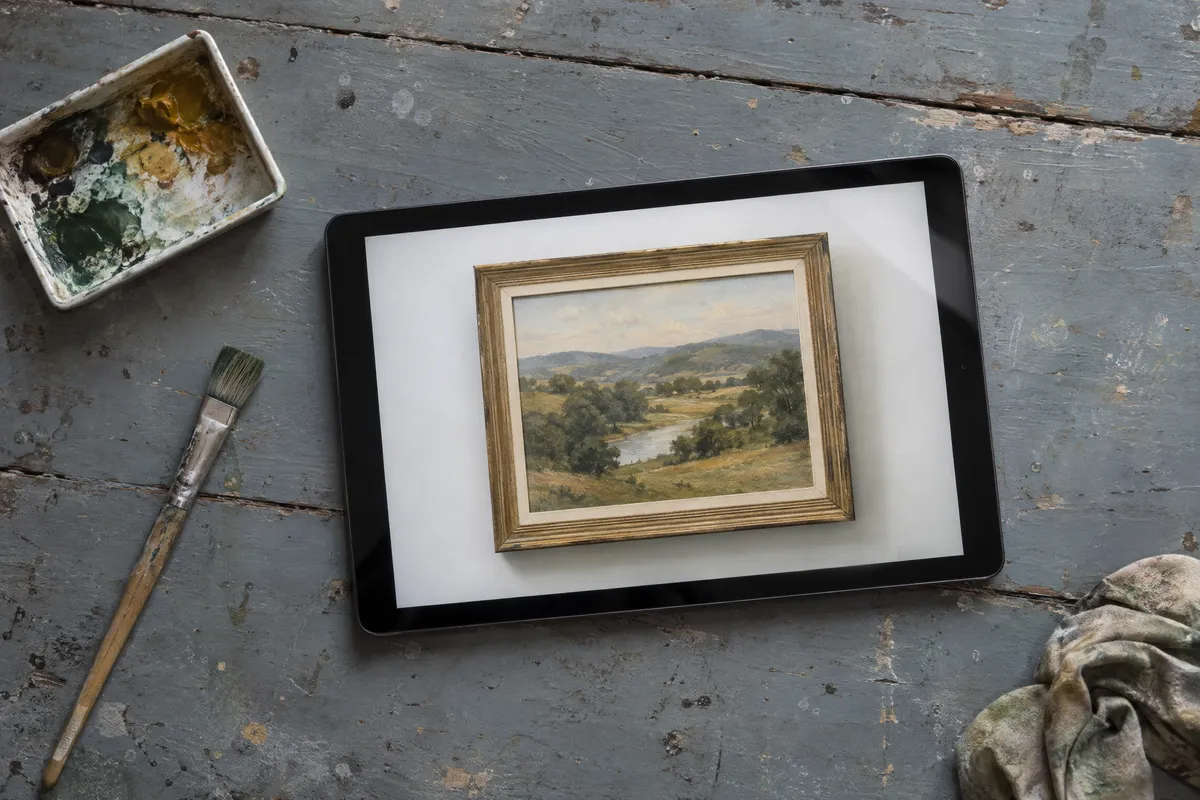
Oil paintings, representational art, portraits, and traditional landscapes pair naturally with classic wood frames. These frames feature:
- Warm wood tones (walnut, oak, mahogany)
- Carved or beveled details
- Gold or bronze leaf accents
- Substantial profiles (1.5-3 inches)
Classic frames communicate permanence, value, and tradition, exactly what traditional artwork deserves.
Contemporary Art → Modern Frames
Abstract art, minimalist pieces, and contemporary work call for modern frames. Characteristics include:
- Clean, simple lines
- Metal or black painted wood
- Thin to medium profiles
- No ornate details
- Float mounting options
Modern frames let contemporary art speak for itself without historical references competing for attention.
Photography → Minimal Frames
Most photographs work best in minimal frames: thin profiles that create a finished edge without dominating the image. Consider:
- Black, white, or natural wood
- Very thin profiles (under 1 inch)
- Simple, clean lines
- Generous mat boards for emphasis
Photography is inherently modern, even when depicting classic subjects. Minimal frames honor this characteristic.
Statement Pieces → Ornate Frames
Some artwork demands drama. Classical reproductions, formal portraits, and museum-quality pieces may warrant baroque or ornate frames:
- Gold or silver leaf
- Carved scrollwork
- Wide, elaborate profiles
- Museum glass for protection
Use ornate frames sparingly; they should enhance, not overwhelm, truly exceptional pieces.
Advertisement
Color Theory for Framing
Frame color significantly impacts how artwork is perceived. Here's how to think about color selection.
The Complement Rule
Look at your artwork and identify the dominant colors. Then consider:
- Warm artwork (reds, oranges, yellows): Gold, bronze, warm wood tones
- Cool artwork (blues, greens, purples): Silver, black, cool gray, white
- Neutral artwork (black, white, gray, brown): Almost any frame works; consider the room
The Contrast Approach
Sometimes matching creates harmony; other times contrast creates impact.
- Light artwork + dark frame = Drama, definition
- Dark artwork + light frame = Modern, gallery feel
- Colorful artwork + neutral frame = Artwork dominance
- Subtle artwork + bold frame = Frame as design element
Pulling Colors
A sophisticated technique is "pulling" a secondary color from the artwork into the frame. If a primarily blue painting has hints of gold, a gold frame creates subtle cohesion without matching too literally.
Mat Board Colors
Mat boards add another color decision:
- White/off-white: Classic, safe, universally appropriate
- Black: Modern, dramatic, emphasizes dark areas
- Cream/ivory: Softer than white, excellent for traditional work
- Colored: Only when deliberately pulling a color from the artwork
When in doubt, white or off-white mats work for most artwork.
Proportion and Scale
The physical size of your frame matters as much as style and color.
Frame Width Guidelines
- Small artwork (under 11x14"): Thin frames (0.5-1")
- Medium artwork (11x14" to 24x36"): Medium frames (1-2")
- Large artwork (over 24x36"): Wider frames (2-4")
These are guidelines, not rules. Bold graphic art might support a thin frame even at large sizes, while delicate small pieces might benefit from substantial frames.
Mat Width Guidelines
Mat boards should be proportional to artwork:
- Standard: 2-3 inches on all sides
- Gallery style: 3-4 inches for more presence
- Minimal: 1-2 inches for contemporary look
The 60/40 Rule
The artwork should remain the focus. As a general rule, the frame and mat together should take up less of the presentation than the artwork itself.
Matching Frames to Room Decor
While the artwork should drive frame selection, the display environment matters too.
Traditional Interiors
Homes with classic architecture, antique furniture, and warm color palettes welcome:
- Wood frames in warm tones
- Gold or bronze accents
- Substantial, detailed profiles
- Traditional mat treatments
Modern Spaces
Contemporary homes with clean lines and minimal decoration suit:
- Simple frame profiles
- Black, white, or metal frames
- Float mounting for dimension
- Thin or no mat boards
Eclectic Interiors
Spaces mixing styles offer the most flexibility. Consider the wall color and nearby elements, then choose frames that either blend or deliberately contrast.
Gallery Walls
When grouping multiple pieces:
- Cohesive approach: Use identical frames for all pieces
- Curated approach: Vary frames but maintain color consistency
- Eclectic approach: Mix styles intentionally for collected feel
Frame Materials
The material affects both appearance and durability.
Wood Frames
- Pros: Warm, classic, versatile, many finishes
- Cons: Can warp in humidity, heavier
- Best for: Traditional art, photographs, most applications
Metal Frames
- Pros: Modern, lightweight, durable, clean lines
- Cons: Cold feeling, limited styles
- Best for: Contemporary art, photography, minimalist spaces
Composite/Synthetic Frames
- Pros: Affordable, consistent, lightweight
- Cons: Less premium feel, limited finishes
- Best for: Everyday framing, temporary displays, budget projects
Testing Before Committing
Custom framing is expensive. Before committing, test your choices virtually.
Our Picture Frame Generator lets you:
- Upload your artwork
- Try different frame styles
- Adjust mat colors and widths
- Preview against wall colors
- Switch quickly between options to compare them
Virtual testing saves money by preventing costly framing mistakes. You can experiment with dozens of combinations in minutes, something impossible at a physical frame shop.
Try the Picture Frame Generator now →
Common Framing Mistakes
Mistake 1: Matching Frame to Furniture
Frame should match artwork, not the couch. Furniture changes; artwork shouldn't need reframing.
Mistake 2: Always Choosing Safe Options
Black frames are safe, but not always best. Take creative risks when artwork calls for it.
Mistake 3: Ignoring Mat Boards
Mats aren't just spacers; they're design elements. Use them intentionally.
Mistake 4: Proportional Mismatch
Delicate watercolors in massive frames (or bold paintings in tiny frames) create dissonance.
Mistake 5: Following Trends Blindly
Framing trends come and go. Choose what serves your artwork, not what's currently popular.
Quick Reference Guide
| Artwork Type | Frame Style | Mat Board | Profile Width |
|---|---|---|---|
| Oil painting | Classic wood | Linen or gold | 2-3" |
| Watercolor | Simple wood | White/cream | 1-2" |
| Photography | Modern/minimal | White | 0.5-1" |
| Abstract | Float or minimal | Optional | 1-2" |
| Poster | Metal or basic | Optional | 0.5-1" |
| Portrait | Classic | Warm white | 1.5-2.5" |
Making Your Final Decision
After considering style, color, proportion, and material, narrow your choices to 2-3 options. Then ask:
- Does the frame enhance the artwork without dominating it?
- Is the frame appropriate for where it will hang?
- Will this choice age well, or is it trendy?
- Does the overall presentation feel intentional?
If you answer yes to all four questions, you've found your frame.
Next Steps
Ready to find the perfect frame for your artwork?
- Analyze your artwork: Note style, colors, size, and feeling
- Consider your space: Think about where it will hang
- Test virtually: Use our Picture Frame Generator to try options
- Compare styles: Explore classic, modern, minimal, and baroque options
- Make your choice: Trust your eye and the principles in this guide
The perfect frame is out there. With these guidelines and virtual testing tools, you'll find it without the expensive trial and error of traditional framing.
Start experimenting with frame styles now using our free Picture Frame Generator, no signup required.