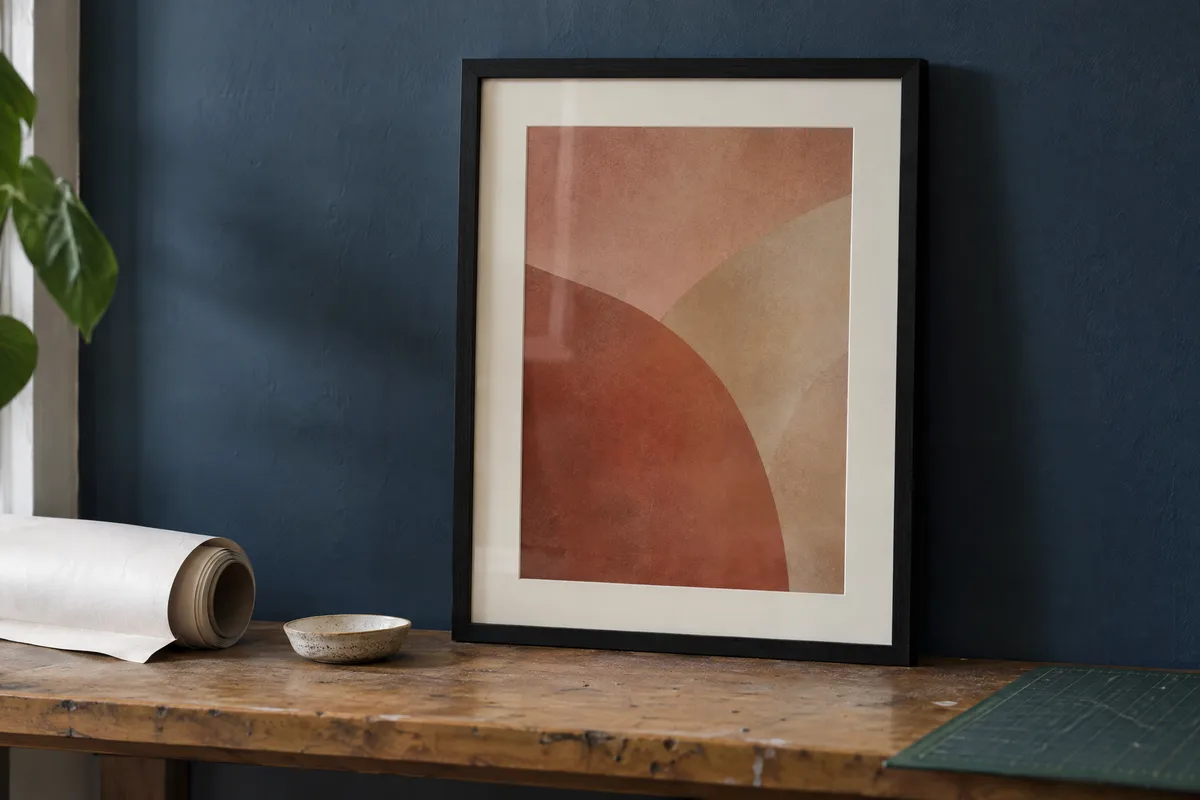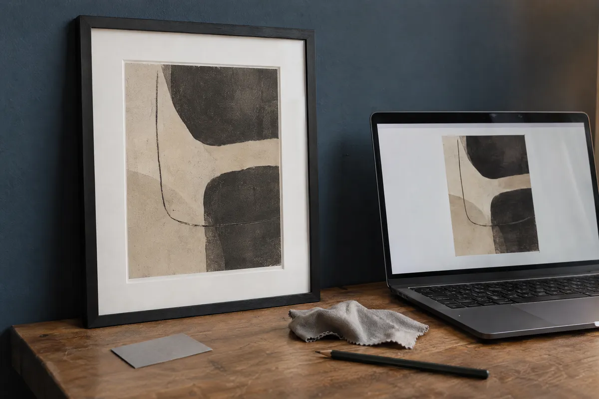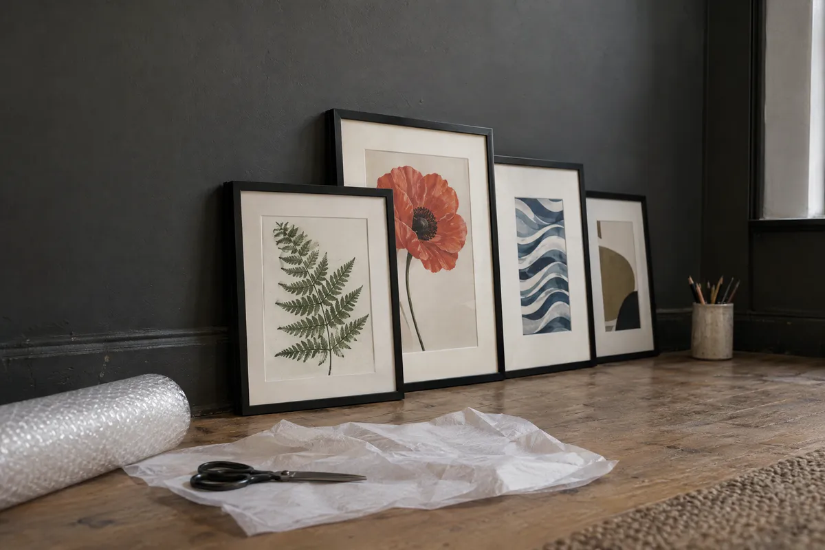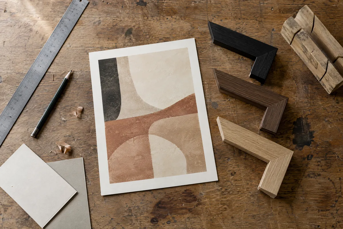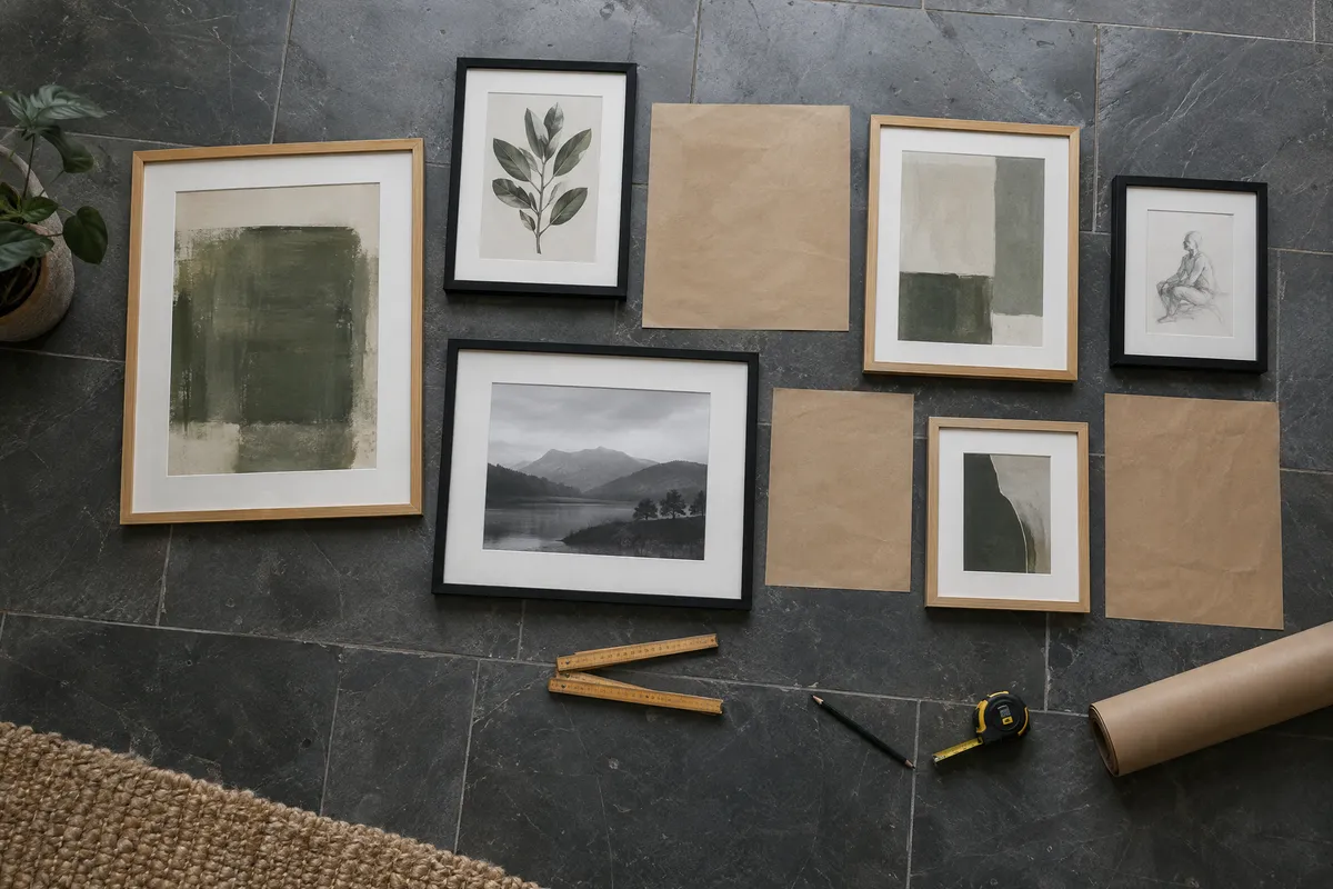
Creating a gallery wall shouldn't be overwhelming. This guide shares proven layout patterns, spacing rules, and step-by-step techniques to help you create a stunning gallery wall that looks professionally designed.
The Art of the Gallery Wall
A gallery wall transforms blank space into a personalized statement. Whether you're displaying family photos, collected artwork, or a mix of both, the right arrangement makes all the difference between a cohesive display and a chaotic mess.
The secret? Successful gallery walls follow proven patterns. Once you understand these layouts and spacing principles, creating your own becomes surprisingly straightforward.
Classic Gallery Wall Layouts
1. The Grid Layout
The grid is the easiest layout to execute perfectly. Identical frames arranged in rows and columns create a clean, modern look.
Best for:
- Minimalist interiors
- Photo series or collections
- Modern and contemporary spaces
- Beginners to gallery walls
How to create:
- Use identical frames (same size, same color)
- Space evenly (typically 2-3 inches between frames)
- Align both horizontally and vertically
- Use a level and measuring tape for precision
Pro tip: Grid layouts work best with an even number of frames arranged symmetrically: 4 frames (2x2), 6 frames (2x3 or 3x2), or 9 frames (3x3).
2. The Salon Style (Eclectic) Layout
Inspired by 19th-century Paris salons, this layout mixes various frame sizes and styles for a collected, artistic feel.
Best for:
- Eclectic and bohemian spaces
- Mixed art collections
- Vintage and traditional homes
- Displaying varied artwork sizes
How to create:
- Mix frame sizes (large, medium, small)
- Maintain consistent spacing (2-3 inches)
- Keep frames within an invisible boundary shape
- Balance visual weight across the arrangement
Pro tip: Start with your largest piece slightly off-center, then build around it.
3. The Centerline Layout
All frames align along a horizontal centerline running through the middle of each piece. This creates order while allowing varied frame sizes.
Best for:
- Hallways and staircases
- Above furniture with varying heights
- Transitional spaces
- Mixed frame sizes with clean look
How to create:
- Draw an imaginary horizontal line at eye level (57-60 inches)
- Center each frame's midpoint on this line
- Maintain consistent spacing between frames
- Allow heights to vary while centers align
4. The Symmetrical Layout
Perfectly mirrored arrangements on either side of a central axis. Classic and formal.
Best for:
- Above beds or sofas
- Formal dining rooms
- Traditional interiors
- Pairs or even-numbered collections
How to create:
- Identify your center point
- Mirror frame sizes and positions exactly
- Use identical frames for maximum impact
- Ensure perfect alignment with measuring
5. The Asymmetrical Balance Layout
Different-sized frames arranged to create visual balance without perfect symmetry. Dynamic and interesting.
Best for:
- Modern living spaces
- Creative personalities
- Mixed media collections
- Statement walls
How to create:
- Balance large frames with groups of smaller ones
- Distribute visual weight evenly
- Keep within an overall boundary shape
- Step back frequently to assess balance
Advertisement
Frame Spacing Guidelines
Proper spacing is crucial. Too close feels crowded; too far looks disconnected.
Standard Spacing Rules
| Frame Size | Recommended Spacing |
|---|---|
| Small (under 8x10) | 1.5-2 inches |
| Medium (8x10 to 16x20) | 2-3 inches |
| Large (over 16x20) | 3-4 inches |
| Mixed sizes | 2-3 inches (consistent) |
Spacing from Furniture
| Furniture | Spacing Above |
|---|---|
| Sofa | 6-12 inches |
| Console/buffet | 6-10 inches |
| Bed headboard | 8-12 inches |
| Fireplace mantel | 6-12 inches |
Edge Spacing
Leave visible breathing room between a gallery wall and:
- Corners
- Door frames
- Windows
- Ceiling
Choosing Frames for Your Gallery Wall
Option 1: Matching Frames
Identical frames create a cohesive, curated look.
Benefits:
- Easy to arrange
- Clean, professional appearance
- Focuses attention on the artwork
- Simple to expand later
Best frame choices for matching sets:
- Simple black frames for modern spaces
- White frames for light, airy rooms
- Natural wood for warm, organic feels
- Gold or brass for glam aesthetics
Explore minimal frame styles or modern frames for clean gallery wall looks.
Option 2: Mixed Frames
Varied frames add character and visual interest.
Tips for mixing successfully:
- Limit to 2-3 frame finishes
- Keep one element consistent (width, style, or mat color)
- Balance ornate with simple
- Distribute different styles evenly
Safe combinations:
- Black + white + natural wood
- Gold + white + cream
- Different woods in similar tones
- Mixed metals in same temperature (warm or cool)
Option 3: Frame Color Coordination
Match frames to your room's color palette.
- Neutral walls: Any frame color works
- Bold walls: Neutral frames let art stand out
- Matching scheme: Pick up accent colors from decor
Step-by-Step: Creating Your Gallery Wall
Phase 1: Planning
- Choose your wall: Consider lighting, visibility, and traffic
- Gather your art: Collect more pieces than you think you need
- Decide on a layout: Pick from the patterns above
- Select frames: Matching or coordinated mix
Phase 2: Preparation
- Frame everything: Have all pieces ready before starting
- Measure your wall space: Note width and height available
- Create paper templates: Cut paper to match each frame size
- Preview digitally: Use tools to visualize the arrangement
Use our Picture Frame Generator to preview frame styles, then try View in Room to see how the gallery will look on your wall.
Phase 3: Layout Testing
- Arrange on the floor: Lay frames face-up and experiment
- Tape paper templates: Transfer your floor layout to the wall
- Live with it: Step back, view from different angles, wait a day
- Adjust as needed: Move templates until perfect
- Take a photo: Document the final template position
Phase 4: Installation
- Mark hanging points: Through paper templates
- Remove templates one at a time: Hang frame immediately
- Start with the center or largest piece
- Use a level for each frame
- Final adjustments: Small shifts are normal
Gallery Wall Ideas by Room
Living Room Gallery Walls
Above the sofa:
- Width: 2/3 to 3/4 of sofa width
- Height: 6-12 inches above sofa back
- Layout: Salon style or symmetrical work well
Statement wall:
- Can extend floor to ceiling
- Mix large and small pieces
- Consider adding shelves or dimensional objects
Hallway Gallery Walls
Long hallways:
- Centerline layout works perfectly
- Creates visual interest in pass-through spaces
- Consider a cohesive theme (travel, family, black & white)
Stairways:
- Follow the angle of the stairs
- Keep spacing consistent along the incline
- Usually requires centerline alignment
Bedroom Gallery Walls
Above the bed:
- Symmetrical layouts feel calming
- Width: Equal to or slightly less than headboard
- Single large piece or small grouping both work
Vanity or reading nook:
- Smaller, intimate arrangements
- Personal or inspirational pieces
Dining Room Gallery Walls
Behind buffet/sideboard:
- Two-thirds rule applies
- More formal arrangements suit dining
- Consider artwork theme (food, botanicals, abstracts)
Full wall display:
- Salon style creates conversation
- Mix art with mirrors for light reflection
Gallery Wall Themes That Work
Photography Collections
- Family photos: Mix candid and posed
- Travel memories: Map-themed arrangement
- Black and white: Timeless, cohesive look
- Instagram favorites: Square grid layout
Art Collections
- Single artist: Cohesive style throughout
- Color theme: United by palette
- Mixed media: Prints, paintings, textiles
- Time period: Mid-century, contemporary, vintage
Mixed Media Galleries
Combine with:
- Mirrors (add light and depth)
- Clocks
- Wall sculptures
- Small shelves with objects
- Woven baskets
- Botanical specimens
Common Gallery Wall Mistakes
1. Hanging Too High
Problem: Art floating disconnected from furniture Solution: Standard eye level is 57-60 inches to center; lower when above furniture
2. Frames Too Spread Out
Problem: Looks like separate pieces, not a collection Solution: Tighten spacing to 2-3 inches
3. Ignoring Visual Weight
Problem: Heavy frames clustered on one side Solution: Distribute dark, large, and ornate frames evenly
4. Wrong Scale for Wall
Problem: Tiny collection on huge wall (or vice versa) Solution: Above furniture, the gallery should span 2/3 to 3/4 of its width
5. No Unifying Element
Problem: Collection looks random and chaotic Solution: Consistent spacing, frame finish, mat color, or theme
6. Skipping the Template Step
Problem: Multiple holes, crooked arrangement, frustration Solution: Always template with paper first
Tools for Planning Your Gallery Wall
Digital Planning Tools
- Picture Frame Generator: Preview frames on your artwork
- Wall Art Mockup Generator: Visualize arrangements
- View in Room: See framed art in room settings
Physical Planning Tools
- Kraft paper or newspaper for templates
- Painter's tape (won't damage walls)
- Level (laser level for large galleries)
- Tape measure
- Pencil for marking
Helpful Apps
- Pinterest for inspiration
- Room planning apps
- Photo editing apps for mockups
Gallery Wall Inspiration by Style
Modern Minimalist
- Grid layout with matching frames
- Black or white frames
- Limited color palette in artwork
- Generous spacing
- Clean, geometric arrangement
Bohemian Eclectic
- Salon style with mixed frames
- Incorporate textiles and objects
- Rich, varied artwork
- Plants nearby
- Layered, collected feeling
Classic Traditional
- Symmetrical arrangements
- Ornate or classic wood frames
- Coordinated mat colors
- Formal artwork choices
- Balanced, orderly appearance
Scandinavian
- Light wood or white frames
- Nature-inspired artwork
- Plenty of white space
- Simple, uncluttered
- Functional beauty
Final Tips for Success
- Start collecting: Build your gallery over time rather than buying everything at once
- Mix personal and purchased: Family photos alongside art creates warmth
- Leave room to grow: Plan for adding pieces later
- Use proper hardware: Match hangers to wall type and frame weight
- Light it well: Picture lights or track lighting enhance galleries
- Preview first: Always visualize before hanging
Conclusion
A gallery wall is an investment in your home's personality. Take time to plan, use templates, and preview your arrangement before putting holes in walls. The effort pays off with a display that looks professionally designed and tells your unique story.
Start by framing your favorite pieces using our Picture Frame Generator, then use View in Room to test different arrangements. Once you have your layout perfected digitally, executing on your actual wall becomes straightforward.
Your perfect gallery wall is waiting to be created. Choose a layout that speaks to you, gather your favorite pieces, and transform that blank wall into a statement of personal style.
Ready to start your gallery wall? Frame your artwork with our free Picture Frame Generator and preview arrangements with View in Room, no signup required.